Analyzing Hepatitis Survival With a Decision Tree
In this article, I have a set of data on patients with acute hepatitis. The dataset is small and contains information on only 155 patients. Given how little data this is, I will not be attempting to build a predictive model that generalizes to patients outside of the dataset.
Instead, I will simply use this opportunity to talk about the CART decision tree algorithm and use it to identify features that are most important for understanding hepatitis survival among patients within the dataset. What is very interesting about this use case is that at least three research papers disagreed with each other on what the important features are: “Breiman 2001”, “Cestnik et al 1987”, and “Diaconis & Efron 1983”.
Data Description and Cleaning
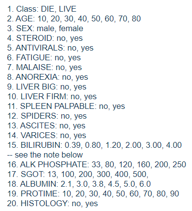
The dataset comes from https://archive.ics.uci.edu/ml/datasets/hepatitis. According to the link, it was put together and generously contributed by Gail Gong at Carnegie-Mellon University. As mentioned before, this is a set of data on 155 patients with acute hepatitis. The key variable is “class”, which indicates whether the patient survived. In addition, there are 19 other features. The list below is taken from the dataset’s webpage.
The binary features described by words are encoded as 1 to represent the category on the left, and 2 for the category on the right. For example, the “steroid” variable is either a 1 for “no”, or a 2 for “yes”. It is not stated as to how exactly the “class” variable is defined. My guess is that these patients were admitted to hospital for treatment. “Live” might mean that they survived their stay and were later discharged.
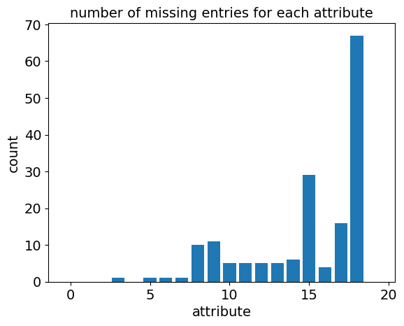
The data set is missing a header, which I added. Next, I looked at the values that are missing, all of which have a “?” symbol in the dataset.
We can see from the plot above that there are quite a few missing values!
Handling Missing Values
Decision tree algorithms iteratively split datasets into two subgroups and so could technically ignore missing values, by deciding the optimal split based only on the data points that are present. Unfortunately, the sklearn module for decision trees does not support missing values!
Dealing with missing data and imputation is a big topic that is too complicated to discuss here. For this set of data, I am going to try simply replacing missing values with the most frequent value if categorical, or with the column’s median if not categorical. This is the less complicated of the two approaches recommended by the creator of the CART and random forest algorithm. A more reasonable but involved approach might be to fill in the missing values of a row using values from similar rows.
The python code for adding a header, plotting, and filling in missing values are in the data processing.txt file in the attachment section at the top of this article.
CART Decision Tree Algorithm
Now that the data has been cleaned, we are ready to fit a decision tree to it.
There are various methods for constructing decision trees. I chose to use the famous CART algorithm introduced by Breiman, Friedman, Olshen, and Stone in their 1984 book, “Classification and Regression Trees”. CART has been considered one of the “top 10 algorithms in data mining”.
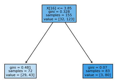
The CART algorithm selects a feature and use its value to split the set of data into two subsets.
For example, the figure above shows how such a split can be done at feature $ x_{16} $ . 72 data points (samples) with attribute values $ x_{16} <= 3.85 $ are assigned to the left node, while the 83 data points with $ x_{16} > 3.85 $ are assigned to the right node.
The same criteria is then applied independently to each of the two resulting subsets, to split them into more subsets. This process is then repeated iteratively until nodes contain only one class or some other stopping criteria.
While there are quite a few other things that makes CART different from other decision tree algorithms, I am just going to stop at this description of how the splitting is done. Please refer to the “top 10 algorithms in data mining” paper for a complete breakdown of CART.
Gini Impurity Splitting Criteria
Two important questions that arise here are: which feature do we choose? How do we choose the cutoff point for assigning data points to the left and right nodes? CART does this by selecting the feature, and split, that minimizes the weighted sum of the gini impurities of each resulting child nodes, weighted by the proportion of data points in each node.
The output diagram reports the gini impurity of each node. For example, the root node in the figure above has gini impurity $ 0.328 $ .
Gini impurity is an interesting metric for how “mixed” a set of data is. The most straightforward way to describe it is the probability that two randomly selected points have different labels. It has a rather interesting alternative definition:
-
Pick a random data point from the set.
-
Randomly label the data point, using the proportions of the labels in the set as the probabilities.
-
Calculate the probability that it is wrongly labeled.
For example, if the proportion of a label is $ p $ , then the probability of a random data point getting the wrong label is $ p(1-p) + (1-p)p = 2p(1-p) $ . This is maximized at $ p = 0.5 $ , when the data is evenly split.
This concept can be extended to sets with multiple labels by summing up $ p_i (1-p_i) $ for each label class $ i $ . There is an alternative metric called information gain criteria but research on their differences suggests that both metrics are interchangeable.
Fitting the Model to Data
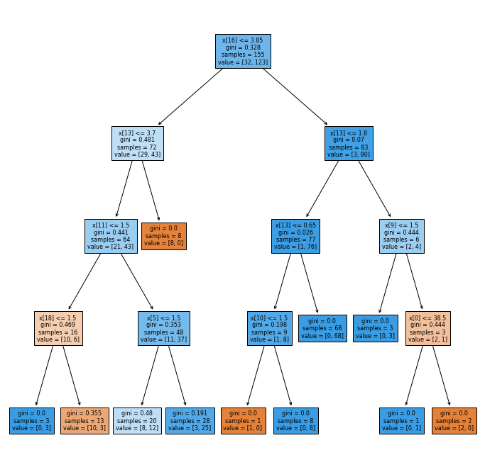
The python code for generating the decision tree and performance metrics can be found in the decision_tree.txt file in the attachment section at the top of this article. I have arbitrarily restricted the maximum depth to 4 to generate the figure below.
Note that there might be slight differences with the decision tree generated each time this code is run. This is because if two splits are tied for the “best”, the choice of splits is chosen randomly.
Confusion Matrix and Performance Metrics
Since the dataset consists of only 155 samples, I will not be trying to use my fitted decision tree as a predictive model. I will only focus on trying to understand what features are important for separating the two survival classes. However, we can still look at some rudimentary metrics to see how good the fit is.
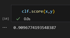
The sklearn decision tree classifier module has a “score’ method that returns the subset accuracy of my model, which is simply the percentage of data points that are correctly labeled.
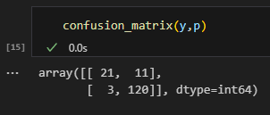
The fit is surprisingly good at around 90.96%. Next, let’s take a look at the confusion matrix for my model. Good thing for us, sklearn has a module for this.
As shown above, it produces a matrix with the $ (i,j) $ entry containing the number of data points that has true label $ i $ , but is classified $ j $ by our model. Note that the diagonals entries have coordinates $ (i,i) $ and therefore contain the number of data points that are correctly labeled by our model.
Also notice that in the figure above, there are only 11 + 3 mislabeled data points on the off diagonal.
Variable Importance
Again, we are lucky that Sklearn’s decision tree classifier has a built-in feature importance property. This computes the Gini importance, which is the total reduction in Gini impurity brought about by each feature. Impurity based feature importance are biased and tend to favor high cardinality features for fully grown trees. Since we have a restriction to a depth of 4 here, we should be fine.
We can then find the index position of the variables, ordered by their importance. Of course, this only makes sense for the ones that appear in our model and thus have non-zero Gini importance.
For simplicity, I am just going to list all 8 variables appearing in my model as “important” in the table below.
Comparison to Research Papers
As mentioned at the beginning of this article, Here is a summary of the important variables
| Source | Important Variables |
|---|---|
| Peter Gregory (see next line) | $ x_{5} $ = malaise, $ x_{11} $ = ascites, $ x_{13} $ = bilirubin, $ x_{18} $ = histology |
| “Diaconis & Efron 1983” | Cited Peter Gregory and found no strong evidence that those four variables were important. |
| “Breiman 2001” Logistic Regression | $ x_{6} $ = anorexia, $ x_{10} $ = spiders |
| “Breiman 2001” Random Forest | $ x_{11} $ = ascites, $ x_{16} $ = albumin |
| “Cestnik et al 1987” | $ x_{4} $ = fatigue, $ x_{10} $ = spiders, $ x_{17} $ = protime |
| This Article | $ x_{16} $ = albumin, $ x_{13} $ = bilirubin, $ x_{11} $ = ascites, $ x_{18} $ = histology, $ x_{5} $ = malaise, $ x_{10} $ = spiders, $ x_{9} $ = spleen palpable, $ x_{0} $ = age |
I am not surprised that there is a lot of overlap between the variables important in my decision tree model and those in Breiman 2001’s random forest model. Since the CART algorithm was created by Breiman and used in his random forest algorithm.
Given that Breiman 2001 concluded that $ x_{16} $ = albumin and $ x_{11} $ = ascites are surrogates for each other, and that the next four “important” variables in my model is exactly those stated by Peter Gregory, I suspect that Peter Gregory was actually correct about the variable importance in the first place!
Unfortunately, given that we only have 155 data points to work with, this is probably as far as I can go. I suspect a lot of the variations between the results in the table above are simply due to the small sample size. Perhaps I will be able to revisit this hepatitis survival analysis with a larger dataset in the future.
